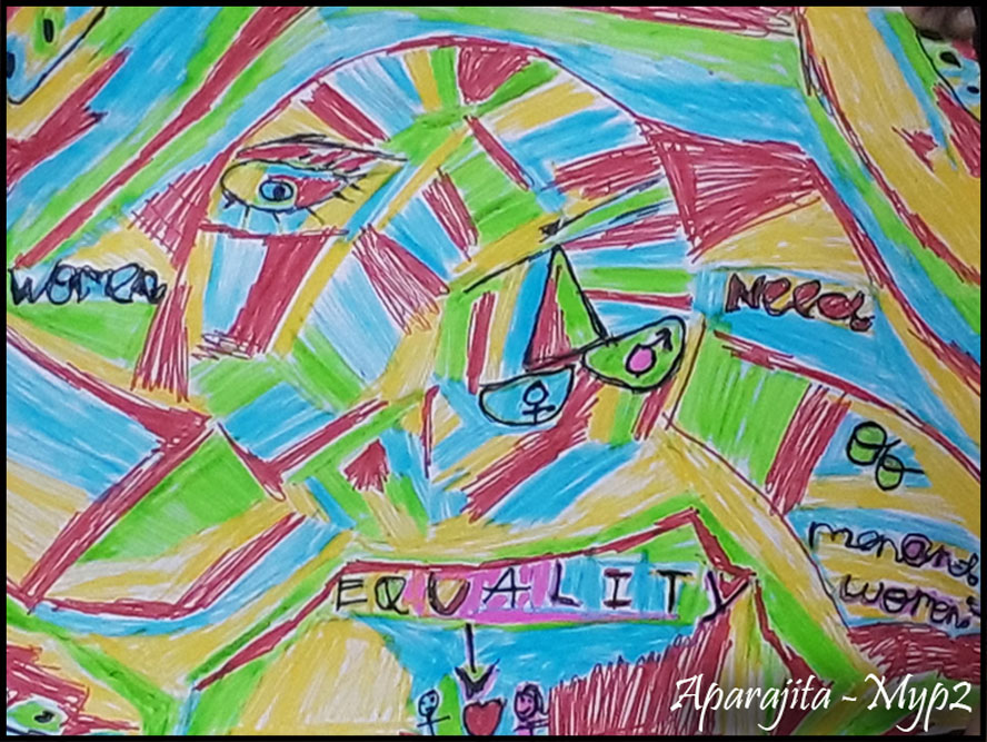
We live in a highly visual world and it is impossible to master the art of visual communication without a good grasp of colour theory. Colours are everywhere. In our daily lives, we are constantly surrounded by colours. These colours can influence our emotions – how we feel about someone or something. Colour is stimulating, calming, expressive, disturbing, impressionistic, cultural and symbolic. It pervades every aspect of our lives, embellishes the ordinary, and gives beauty and drama to everyday objects. If black and white images bring us the news of the day, colour writes poetry.
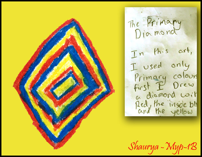
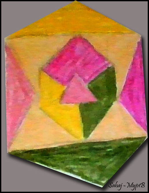
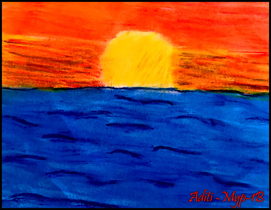
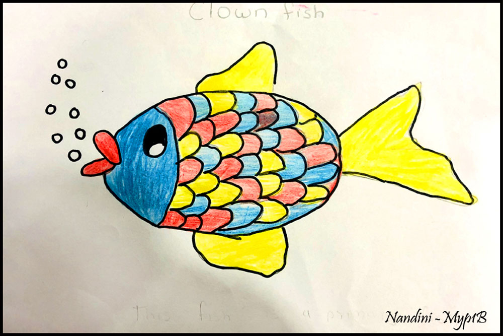
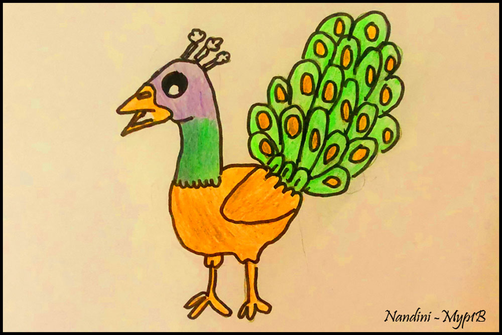
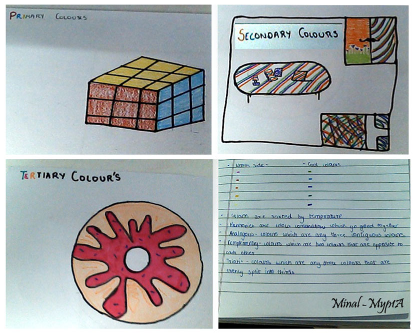
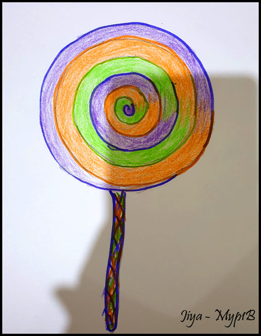
A visual art mentor’s biggest recommendation would be always to take students to the basics and make them understand the colour wheel. It is very important for students to observe and understand the colour wheel which is a visual representation of colours, with hues arranged according to wavelength. Colour wheels allow colour relationships to be represented geometrically and show the relationship between primary colours, secondary colours, tertiary colours, complementary colours, harmonious colours etc. Students develop their conceptual understandings by exploring and experimenting with the colours and they really find it magical when they generate a new colour by mixing two or more colours.
Colour theory also involves a colour’s darkness or lightness, or the colour values. A colour’s hue can be changed by adding white for tint, which will give the lighter pastel colours, and black for shade to darken and dull colour. When grey is added to a primary, secondary or tertiary colour, it creates a tone.
Attaining the concept of colour theory helps students to understand the relationship between colours. They can look closely, make comparisons, and use the colour theory to mix paint that matches any hue they observe. They explain in many ways that the colour wheel allows artists to see the relationship between different colours.
Some highlights:


Leave A Comment